After a very full year of writing reports, giving speeches, and number-checking infographics, I’m left wondering: What’s the most effective way to deliver insights? How can I better serve you?
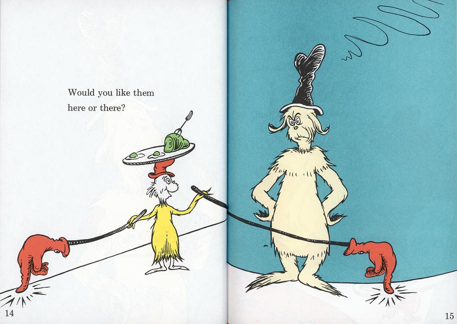
To paraphrase Dr. Seuss: Do you like the data in a table? In a tweet? In a speech? Do you like the numbers in a box? Do you like them with a fox? (Couldn’t resist.) Would you like them here or there? Would you like them anywhere?
How do you hear about new research? Do you tune in right away, when it’s first published, or later? What format do you find useful — tweets, slides, videos, infographics, fact sheets, reports? How about these blog posts I write and the conversations that ensue? What do you find valuable?
Specifically: The Pew Research Center is considering bundling up all of the health reports and infographics from the past year into an e-book. Does that appeal to you?
I’d love to hear from people who are long-time fans of the research as well as people who just learned it exists. How were you introduced to it? Have you read any of the reports, start to finish? Or do you prefer another format?
For those who want to do a little homework, here is a review of the Pew Research Center’s health & tech product line for 2013:
Reports
- Mobile Health: One in three cell phone owners have used their phone to look for health information; half of smartphone owners have done so. 19% of smartphone owners have downloaded a health app.
- Health Online: 59% of U.S. adults say they have looked online for information about a range of health topics in the past year. 35% of U.S. adults say they have gone online specifically to try to figure out what medical condition they or someone else might have.
- Tracking for Health: Seven in ten U.S. adults track a health indicator for themselves or a loved one and many say this activity has changed their overall approach to health. Technology plays a minor role.
- Family Caregivers are Wired for Health: 39% of U.S. adults report that they are caring for a loved one, either an adult or a child with serious health issues. Caregivers are heavy technology users and are much more likely than other adults to take part in a wide range of health-related activities.
- The Diagnosis Difference: 45% of U.S. adults report that they live with one or more chronic conditions. Many remain offline in an online world. However, many take their health decisions seriously—and are seriously social about gathering and sharing information, both online and offline.
Speeches (just a sample)
- University of Maryland, Baltimore: Mobile health in context (related to Mobile Health)
- Hofstra University: E-patients and their hunt for health information (related to Health Online)
- Stanford Medicine X: A conversation about Tracking for Health
- Connected Health: The “e” is for engagement (related to Tracking for Health)
- Health 2.0, Silicon Valley: The Unmentionables of Health (related to Family Caregivers are Wired for Health)
- Albert Einstein College of Medicine at Yeshiva University: The Who, What, Where, When & Why of Health Care Social Media (related to Health Online and The Diagnosis Difference)
- Health 2.0, Silicon Valley: The New Environment for Better Health Care Decisions (related to Tracking for Health and The Diagnosis Difference)
Infographics
- The internet and health
- Who are caregivers?
- Sources of health care information: caregivers
- Health care reviews: caregivers
Video
Fact sheet
- Pew Internet: Health: a shortcut to the most-cited and up-to-date numbers we have.
I have read some of your reports more-or-less front to finish, but I am increasingly mindful of the need to write in multiple formats for different audiences. Even for the more academically minded wonk crowd that is my primary audience, the headline version in Twitter is increasingly the path that leads to the blog that leads to plowing through the full report in more detail. Keep it all coming — especially the Seuss versions!
Thanks, Don! It’s good to know you share my view that Twitter is the gateway to hopefully deeper, eventual engagement with the findings.
I learned today about some research showing the power of video to introduce new concepts — in this particular study, information about end of life care. People who watched a video were more likely than those who were just told the same info to retain the knowledge. I’ll post the citation when I find it. I personally haven’t done much with video but I’m intrigued, esp. after The Diagnosis Difference video I link to in the post. If a picture is worth a thousand words, is a video worth a thousand RTs?
I find the Twitter headlines as good a tease as there is to tweak my curiosity. I do worry about serious research becoming oversimplified or even misstated in the interest of catchiness. Perhaps a predictable cascade of detail would help. From headline (Twitter) to expanded magazine-style overview, with embedded footnote links to hard data with reuse able graphics. Would create a natural path into detail where wanted an to overview when that is ( in the reader’s determination) sufficient.
I think it is important to acknowledge the need for headlines. I really seldom know in advance what will trigger interest then attention then further research. The predictable cascade would honor serendipity in readers’ interest.
I like to be able to manipulate the format of my data. Sometimes it helps me to see it one way, but I know it has a greater impact to my sons doctor if she views it another. I have a bit of a researchy background so I’m always trying to dig out new insights or interpret it any number of ways I can, comparing different things to one another to get a dynamic understanding what I’m really looking at. I know that many researchers would have no interest in me manipulating their data for fear of making inaccurate assumptions and I respect that. I’m not asking for raw data, just the opportunity to play with the format a little 🙂
Nice! We have talked about how to make our data more interactive, but you’re right that more conservative researchers have expressed fears that people could misinterpret findings they come up with on their own. I bet there’s a middle ground and would love to hear of examples.
I agree with everything that’s been said in the previous 2 comments. See some examples of interactive data visualizations http://www.nyi.net/blog/2012/08/5-awesome-interactive-data-visualizations/ (and there are experts – we have some at Purdue – who can help you with those). Interactive data visualizations help people get a better understanding of data and explore more in a small space by clicking and digging deeper – I do not share the concern about manipulation.
Bottom line is, you do good research and the reports are very useful. If you ask, of course we would like various formats and flexibility, but even the PDFs on the Web are just fine. I like reports to be truncated by topic and would not necessarily be interested in having them all in one file (e-book).
Thank you!
I’ve been at conferences for the past 3 days so this morning was my first opportunity to click through on that link to interactive data viz examples — wow!
My colleagues at the Pew Research Center have done some nice interactive treatments:
U.S. Unauthorized Immigration Population Trends, 1990-2012
LGBT Voices: The Coming Out Experience
Global Christianity
There are a few factors at play here:
1) Resources. Some projects have allocated more money for interactives than others — including having dedicated designers and engineers available.
2) Topic. Maybe every data-based project could lend itself to an interactive, but some are more appropriate or successful than others.
3) Imagination. Someone has to have an idea. Again, some topics or projects seem perfect for an interactive, like the immigration patterns in the example above — a big, rich, longitudinal data set. Others need more help, like the display of a deep, rich, one-time data set of quotes about the coming-out experience.
4) Time. Designers and engineers are capable of working on deadline, but breaking news sometimes is best displayed as a flat table or a well-crafted headline (tweet).
Are there other factors?
I thought I’d add a bit of data to the conversation. The Pew Research Center tracks our website traffic and I’m included in the reports shared Center-wide, which are (to me) fascinating.
The top 5 pages for November were:
1) Science and technology news quiz
2) News quiz
3) Obama’s second-term slide continues (a report)
4) How millennial are you? (quiz)
5) Pew Research home page
3 of the next 10 most popular pages are also quizzes.
Lesson: people want to interact with our findings, not just read them — unless it is big, important news or a unique deep dive into a topic. It’s worth noting that the science quiz was released in April, so it’s certainly not new.
Just looking at the most popular report pages, it is a mix of Pew Research topics — politics, religion, technology, journalism. Of the top 16 most popular report pages for November, two are what we call “fact sheets” — a no-frills rundown of what we’ve got on mobile communications and social networking in the U.S. These two fact sheets are always on that most popular list, whether it’s a weekly or a monthly capture of the traffic data.
Lesson: people often just need a quick fact.
One other data point: 3 of the top 16 report pages are posts on the Pew Research Center’s Fact Tank blog. Another vote for brief hits of data.
The more data, the better, and the more easily it can be downloaded in spreadsheet format for further analysis or repackaging, the better. I find that I need to present similar data differently for different audiences. Anything that allows me to do so quickly saves me time and improves my ability to effectively communicate interesting facts!
I’m glad that Pew is on Twitter so that I’m alerted to new research through that medium. I do sometimes go looking for specific data independently but I really like knowing when new reports are available through the convenience of Twitter.
Thanks Susannah for all your work in this area. We at QS Labs like our data “from a known source who will answer our questions!” Perhaps that seems obvious, but it really isn’t common, and the commitment you make to discussing the Pew reports, your calm attitude and open mind, make a big difference in how much we learn. Instead of just allowing ourselves to wonder a bit, and then move on to the next shiny object/twitter post, we end up reading closely, looking up the tabular data when its available, consulting other sources, and thinking harder. Having you standing next to these reports and interpreting them is important. (As you doubtless know.)
Thanks, Gary!
You don’t need me to tell you that you’re doing a great job gathering data, presenting it, and socializing it. Here are a few ideas for you:
1) I appreciate the way Luke Wroblewski shares data as a simple bulleted list. I find it very digestible. Here’s an example: Data Wednesday: iOS vs. Android Engagement (http://www.lukew.com/ff/entry.asp?1838)
2) I’m sure an ebook (or even print edition) would be well-received. Smashing Magazine does a good job packaging up their articles into book form. See this: http://www.smashingmagazine.com/books/
3) If you’re not following Horace Dediu (aka http://asymco.com), you’re missing out. He does a great job making data-rich presentations. He even helped develop new presentation software (http://pixxa.com/) based on his style of presenting(!). And he teaches his presentation method at workshops (http://airshow.asymco.com/) all over the world. He’s doing great work. I’ve learned a ton from him.
4) Lastly, to help facilitate discussion on social networks (namely, Twitter), you should give each report an official hashtag so it’s easier to follow the conversation. If TV shows are doing it, why not research reports too? 🙂
Thank you so much! These are all stellar ideas. My New Year’s resolution will be to implement them.